Navigate to
Hitch
Ride Share App


PROBLEM
PROBLEM
PROBLEM
In what ways can we minimize stress on our dirt roads and improve transportation options?
I live in Costa Rica, in a rural, touristy area; our town doesn't have the capacity or infrastructure to handle a high volume of transit during high tourist season, so this app would help promote ride-sharing and better diffuse visitors around the area instead of specific locations of high concentration, which would help our roads and infrastructure.
TEAM
Solo Project
Solo Project
ROLE
Lead UX/UI Designer
SCOPE
4 months

THE SOLUTION
1. Create a mobile app for tourists on the go that allows for ride-sharing options all over the country.
2. App includes biography and ratings of drivers to ensure passengers feel safe.
3. Reduce emissions and stress on our poor infrastructure and help the environment.
TRANSPARENCY
1. Transparency in ride payment details, both driver and passenger can see the breakdown of fees.
2. Hitch takes a small percentage of the total cost, we strive to help our community members get a fair income.


PASSENGER AND RIDE INFORMATION
1. Users can view ratings and previous reviews left by passengers.
2. Can view pet or child-friendly options as well as room capacity for large baggage items.
Design Process Overview
These are the steps I took in creating Hitch, I will be walking you through them along with my thought process.
Empathize
User Research
Competitor Analysis
Define
Affinity Map
Personas
Ideate
Brainstorm
User flow
Prototype
Sketches
Test
Usability Studies
Wireframe
Lofi & Hifi
Mockup
Understanding the Problem Space
I performed hallway guerrilla-style interviews at my local coffee shop, targeting tourists and backpackers and getting their feedback on moving around this area.
1. User Research
2. Competitor Analysis
USER RESEARCH
I conducted five thirty-minute guerilla-style user interviews to understand the users' needs, wants, and pain points. I created a screener survey and a test plan to ensure the information I gathered was relevant.
When preparing the interview script, I kept the questions open-ended enough for the participant to elaborate on their relationship with ride-sharing and assess their safety level when traveling abroad. It was essential for me to be unbiased and open to identifying their barriers and frustrations.
User Pain Point I
Small towns have very few reliable options for transportation. You either have slow-moving crowded buses or expensive private taxis.
User Pain Point II
People are looking for rides on Facebook, but it’s hard to schedule and say yes or no without knowing or having any history with the person.
User Pain Point III
When traveling alone, it's considered risky to find people going to other destinations without knowing them personally.
COMPETITOR ANALYSIS
The options are minimal when it comes to ride-sharing in Costa Rica. There is a clear need for more transportation services since many only exist in major cities. Transportation options are available to popular destinations, i.e., the airport or the capital, but outside of that, your only options are taking multiple public buses.
Synthesizing Research Findings
Who is our target user?
1. Personas
2. User Journey Map
3. How Might We statements
USER PERSONA
I coalesced our user research for the adventurous traveler with less disposable income and is open to meeting new travelers, looking for options that will be time and cost-effective.

Eco-Conscious Ellie
Age:
Education:
Hometown:
Family:
Occupation:
34
College
Barcelona, Spain
Single cat mom
Freelancer
"I don't want to spend $250 dollars on a taxi that will take me and my cat to Tamarindo."
Goals:
-
Find trustworthy, affordable rides to better move around the country and not feel stuck in one place.
Frustrations:
-
Really hard to meet/find others to carpool
-
Only expensive options are available
Marina is a freelance web designer; she has a pet, making it challenging to move around. She would love to visit more places if it were within her budget.
USER JOURNEY MAP
Eco-conscious, Ellie wants to move to a neighboring town, 2 hours over and dreads the process because of the transportation cost.
Action
Consider
Explore
Compare
Book
Task List
Emotions/
Feelings
Improvement Opportunities
Starts planning to move since her rental expires in a week.
She looks at Airbnb, sees that the town over is more affordable, and wants to relocate.
-
Nervous
-
Anxious
-
Excited
Include an overview of costs and a summary on the search page for easy search.
Searches online for potential bus options
Asks her friends around for advice since many businesses don't have their own website
-
Hopeful
-
Annoyed
Include a feature for an estimated total cost to help travelers budget.
Trims down choices to two potential options, both really expensive.
Gives herself a day to think about it.
-
Upset
-
Trying to be optimistic
Affordable options are needed for more budget-friendly travelers.
Decides to book the option that is slightly cheaper but still almost $250.
-
Happy
-
Responsible
-
Ready to leave
Travelers need flexibility, and allowing them the option to split costs would be beneficial.
'HOW MIGHT WE' STATEMENTS

Reduce the impact and deterioration of our dirt roads?
Improve transportation options to our local area that help travelers feel safe?
Enforce a sustainable, eco-friendly solution?
Conceptualizing the product
I mapped out the user flow and began ideating sketches of the product, then built low fidelity wireframes.
1. User Flow
2. Ideating
USER FLOW
I identified several themes while mapping the user's journey; there was much positivity with the idea of this product, a need for payment transparency, and more details about other passengers currently booked on the ride. From this feedback, I re-iterated my low-fidelity designs.

Ideating

I wanted to make the process as seamless as possible, with a few screens to confirm a ride, considering people who need to book a last-minute ride, which is needed often in my area due to bad roads and needed car repairs.
Iterate, Test, Repeat
I conducted one round of usability tests between the Mid and High Fidelity prototype to improve user experience.
1. Low Fidelity Prototype
2. Usability Studies
3. High Fidelity Updates
4. Mockup
LOW FIDELITY PROTOTYPE

USABILITY STUDY PARAMETERS
Study type:
Hallway Usability Study
Participants:
5
Length:
15-20 minutes
Location:
Cafe Paris - a coffee shop usually filled with backpackers/
travelers
USABILITY FINDINGS
PARTICIPANT A

PARTICIPANT B

PARTICIPANT C

PARTICIPANT D

"I wonder how much the driver is actually getting paid."
"I am confused here. I want to view the filter used to select the order of these."
"It'd be nice to see what rides are available in my local area."
"I want to see their profile again, technically I'll be in the car with them for a while."
AFFINITY DIAGRAM
I identified key themes, which included feature suggestions, current features users found useful, and areas to reduce user confusion.

KEY FINDINGS
5 out of 5 users felt there was too much information on ride profile, they are more focused on key information, can reduce the number of icons on there.
5 out of 5 showed confusion in the ride selection, the data was not grouped and I was displaying too much information at once.
3 out of 5 users showed confusion during the confirmation process, ‘confirm ride’ and ‘confirm driver’ was repetitive.
Before
After


-
Based on my findings, I reduced the number of icons because it was too much information for the user.
-
I better aligned the Name, Bio, and details and added more padding between 'ride details' and iconography to allow more ease in clicking.
Before
After


-
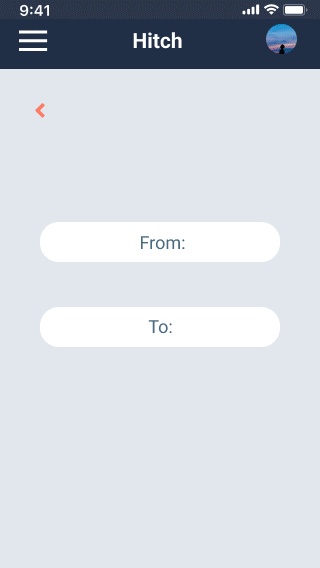
Improved information hierarchy and moved 'to,' 'from' and 'date' to be grouped.
-
Including a 'more info' option for the user to opt-in when more information is necessary is much better than saying a clutter of unwanted information.
UPDATED LO FIDELITY DESIGNS

HIGH FIDELITY DESIGNS

USABILITY FINDINGS
I kept the same format for my usability tests, with 5 participants using guerilla-style tests for 30 minutes each. When I created this app, I wanted to make it for my local community, so it is straightforward for me to find people to interview on the street. An unexpected barrier became apparent- this app caters to financially secure tourists. I would love to include the local community in this app as well.
01
Users wanted more transparency on how much space the ride provided and if their luggage could fit.
02
Users would like more control in the order of viewing the rides, such as a filter icon, to select a preference of time or location.
USABILITY STUDY PARAMETERS
Study type:
Hallway Usability Study
Participants:
5
Length:
15-20 minutes
Location:
Cafe Paris - a coffee shop usually filled with backpackers/
travelers
MOCKUP
*The GIFs below show the UI before and after the usability tests*
Iterations
Final Screen


Aesthetic and Minimalistic Design
These are three different screens displayed on a loop. Each screen was iterated until it finally confirmed that our users were confused by the large image buttons. I decided to simplify them to only text and remove unnecessary background distractions.
Iterations
Final Screen
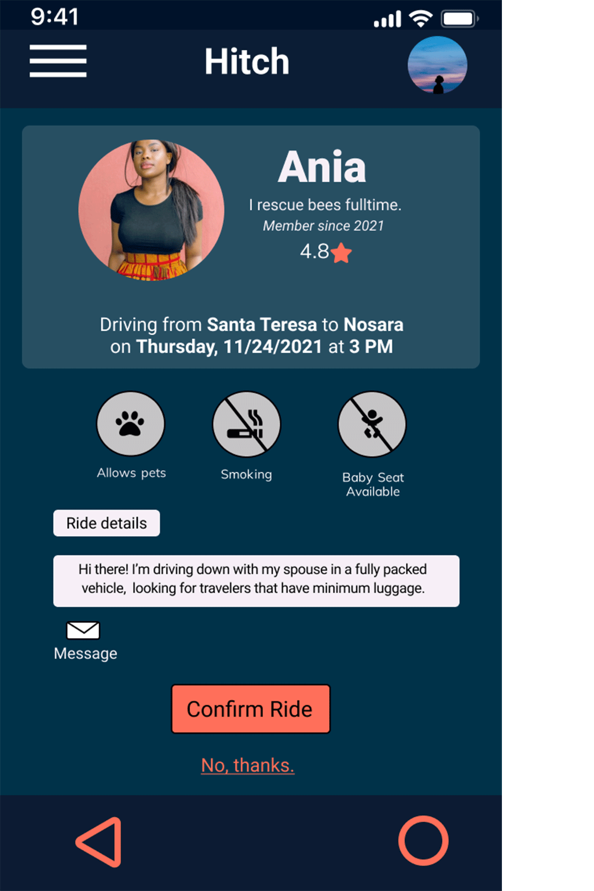


Improved card and font settings and highlighted important icons:
This page was probably my most challenging in that I needed to display much information without overwhelming the user by showing unimportant information. These are three iterations, ultimately deciding on grouping high-priority information in a grey card and improving the color of our buttons to guide the user on where to click next.
Iterations

Final Screen

Removed graphic and emphasized total cost, include cost breakdown:
After 2nd usability study, I updated the wording in the user flow. Hence, the confirmation only appears once in the final step to book rides—enlarged icon text for accessibility and improved color contrast. Also, I itemized the final cost for more transparency instead of listing the total price.
After the 3rd usability study, I focused on improving the navigation within the app and creating excellent color contrast for a cleaner look. Created a filter icon on the list, updated the list view, and increased the icons displaying information about available storage in the vehicle.


Reflections and Learnings
I conducted one round of usability tests between the Mid and High Fidelity prototype to improve user experience.
1. What I Learned
2. Impact
What I Learned
It's essential to have a detailed script when conducting user interviews, not only to allow for time efficiency but also to add room for further questions from the interviewees.
I was also so worried about the design during the early stages, I would not worry so much in the future. Usability studies greatly help inform you of what changes are needed and help highlight areas to improve.
Impact
Many users showed appreciation for this app; there is interest to continue to grow and scale the product.
“I’m not from here and it’s not easy moving around, it’s hard to get around with tuk-tuks and waiting forever for the bus, I would get to see more during my limited stay with this app."
- Participant C
Next steps
1.
Integrate payment options.
2.
Quantitative Usability Studies