Navigate to
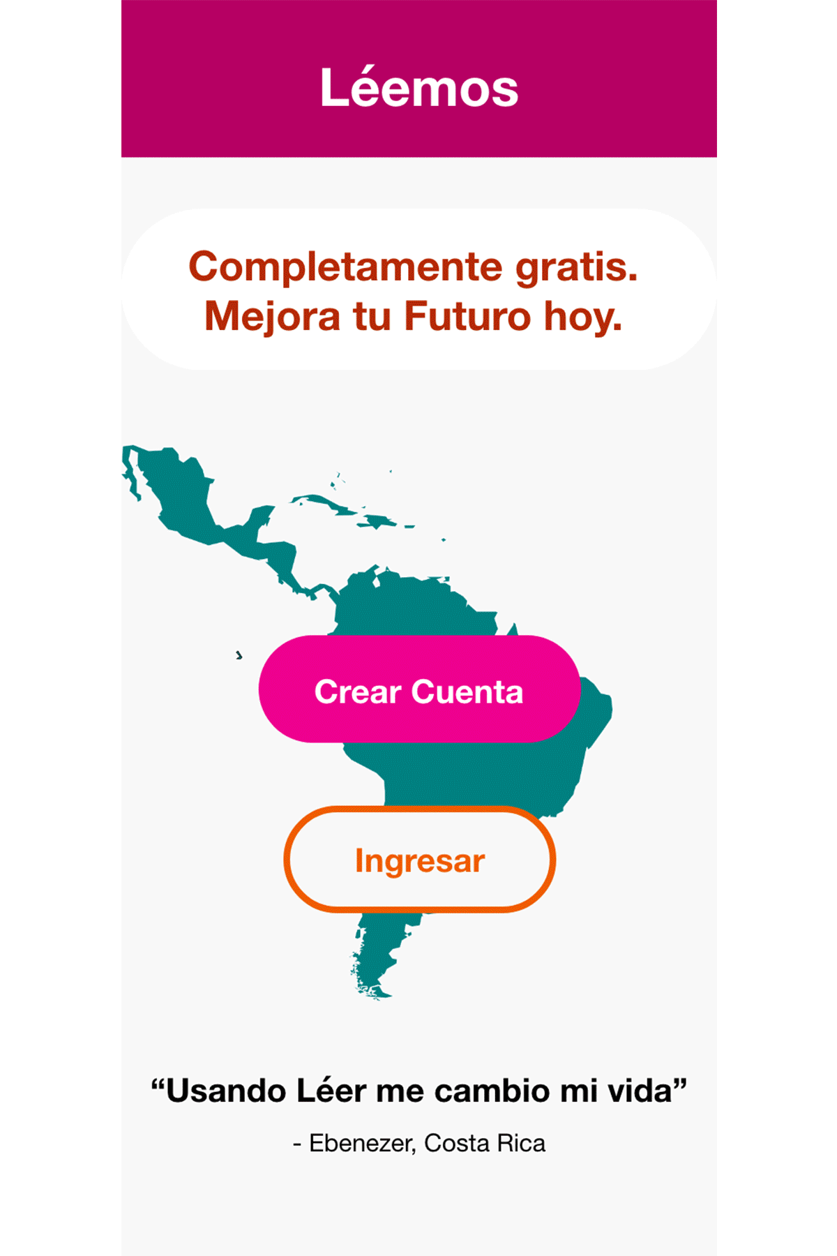
Leémos
Literacy App


PROBLEM
Thirty-six million people in Latin America are illiterate.
Yes, you read that right.
According to UNESCO, 9% of those aged 15 or older are illiterate in Latin America (roughly 36 million people in total). Leémos is a free educational app designed to reduce the illiteracy rate and promote learning while having fun.
Leémos is inspired by my 40-year-old neighbor that can't read. Consequently, he is unable to help his 10-year-old daughter learn to read. Leémos would help break the illiteracy cycle.
TEAM
Solo project
ROLE
UX Designer, UX Researcher, Project Lead
SCOPE
April 2022 -
June 2022


SOLUTION
A kid-friendly mobile app to teach people of all ages.
My goal is to reduce the rate of illiteracy in Latin America. Education is the fastest way to improve people’s lives, and now that most people have a mobile phone, they can access apps more easily.
Minimal aesthetic and large visuals to help accessibility.
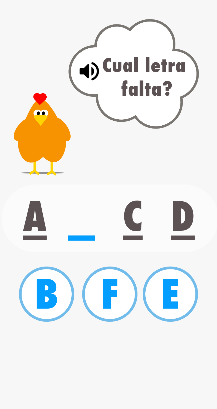
1. An audio feature is present to hear the questions.
2. Large fonts help both children and elderly better read.
3. Encouraging graphics cheer the user on to help motivate them.


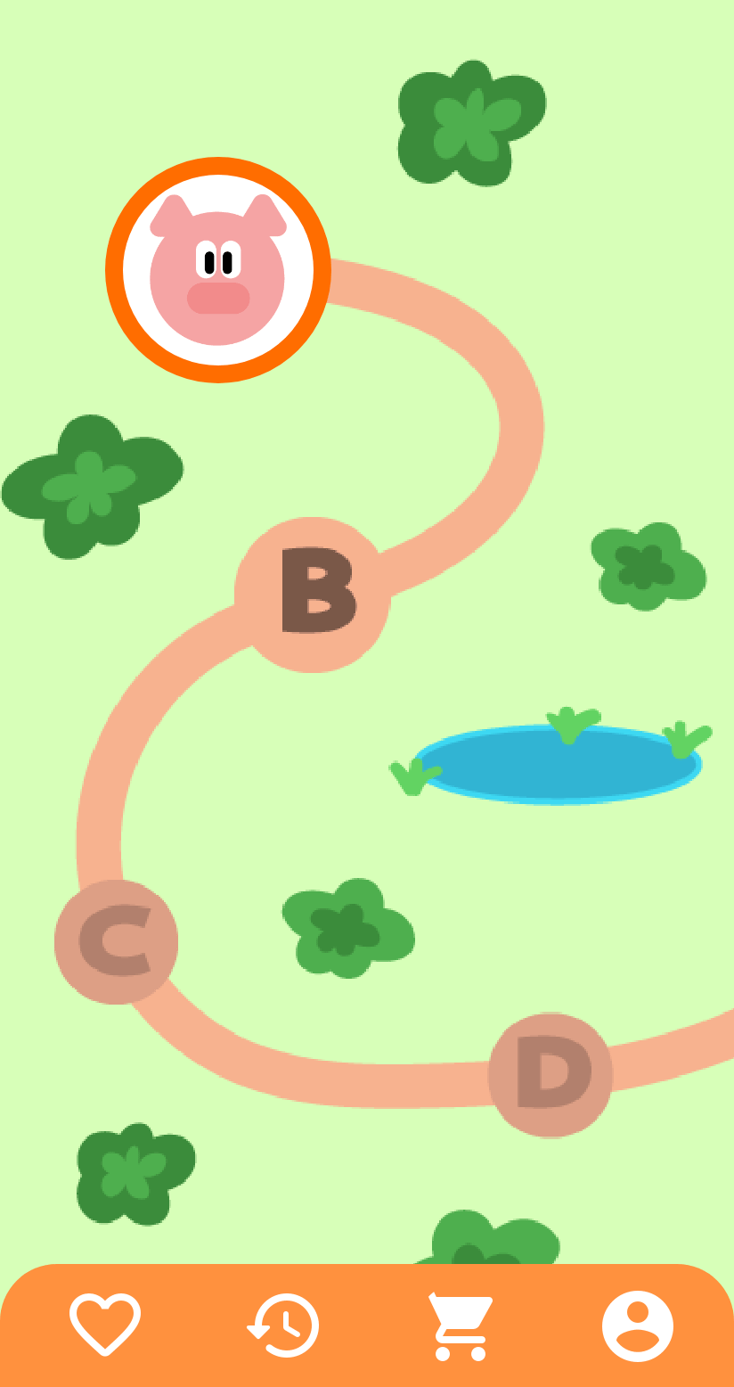
Interactive Game Design
To further encourage users, I felt that following a journey would help the users see their progress as they advance through different terrain. A potential idea to further the towns the pig visits, you help the pig see the world before it has to return to the farm.
Design Process Overview
These are the steps I took in creating Leémos; I will be walking you through them along with my thought process.
Empathize
User Research
Define
Personas
Competitor Analysis
Ideate
Brainstorm
Sitemap
Prototype
Sketches
Test
Usability Studies
Wireframe
Lofi & Hifi
Mockup
Empathize
I conducted qualitative interviews with people ranging from 10 to 65 years old, who cannot read. You may be wondering, how I found them: they're my neighbors in Costa Rica who come from very humble backgrounds.
1. User Research
2. Competitor Analysis

USER RESEARCH
I conducted qualitative research by conducting semi-structured interviews with 5 of my neighbors, ranging from 10 to 65 years old.
I focused on asking open-ended questions to remove any biases and wanted to focus on the app's navigation and how comfortable users were in following the product flow.
Parameters
5 participants
30 min Semi-Structured Interviews
Competitive Analysis
Research Findings
I assumed my neighbors would feel optimistic about learning to read, but if anything, I discovered they carry much shame, and it is not something they would disclose organically. The senior citizens I interviewed didn’t see the point in learning now, considering they’ve adapted to living without the ability to read. The enthusiasm was in the kids under ten because they struggle with it presently in school and get bullied for it.
COMPETITIVE ANALYSIS
There are literacy apps out there, but they are very clunky to use; I downloaded "Leo con Grin," an app developed in Spain, and was very excited to use it since it catered to Spanish speakers; however, it was a huge letdown.
Defining our user and problem
After conducting my qualitative studies I was able to pinpoint my target user: someone who is eager to learn and not settle into acceptance of a generational problem.
1. Personas
2. Problem Statement
PERSONAS
My target users are people from underprivileged backgrounds; however, as the app scales, I can see our target users as any person learning to read. There is potential for a subscription service since many children will have to learn to read, and our app can help them. For now, I want to focus on the next billion users and design the app for them.

Curious Cynthia
"I don’t know how to read. Reading is so boring, I rather play outside."
Goals
-
Feel more confident in her reading capabilities, currently she doesn’t feel like she knows how to read.
Frustrations
-
Gets bored easily and thinks she’s not smart enough if she has so much difficulty with it.
Age: 13
Education: Grade School
Hometown: Costa Rica
Family: Youngest of 4
Occupation: Student
Cynthia’s parents are in their mid-40s and work manual labor jobs; they don’t have the patience to teach her how to read or help her with her homework. Cynthia isn’t confident in her reading abilities and avoids reading at all costs.

Nice Natividad
“My town just got fiber internet and I’m excited to see what I can do on phone."
Goals
-
Be confident reading on her own
-
Have more autonomy in her life
-
Feel more comfortable with modernity
Frustrations
-
Gets easily lost between notifications and banner ads, doesn’t know how to find her way back.
Age: 63
Education: Grade School
Hometown: Costa Rica
Family: Married, mother of 6
Occupation: Housewife
Natividad has worked on her family farm all her life; she didn’t get the chance to learn to read and now wants to take advantage of the opportunities that the internet may bring. She is unsure how to use a tablet but can easily find apps on her homepage.
PROBLEM STATEMENT
Natividad is a 65-year-old labor worker who needs free quality education because she didn't get the opportunity when she was younger.
People of all ages, and from all backgrounds, deserve a quality education; to reduce illiteracy we will provide a free application, designed for all ages, to motivate and teach people to read.
Ideate
I organized my ideas via sketches, based on the needs of my target users and built a sitemap of the navigation. A lot of people out in the countryside have older generation ipads, I wanted to create a design for ipads and android phones, which are commonly used in Costa Rica.
1. Ideation
2. Sitemap
IDEATION
At first, I was trying to make the app engaging and intuitive, almost hiding the fact that it was educational by making it into a series of games. These sketches are in Spanish for my target community.
I did some crazy 8's to come up with useful activities that revolve around learning.

For the actual user flow, I wanted a design that would feel like a game and make it interactive, so I included a map on the home page that helped the main character navigate through each level and feel a sense of direction and purpose.

RESPONSIVE DESIGN
Sitemap
The goal is to motivate and congratulate the user every step while making it interactive and fun and having a sense of community by engaging with friends.

Prototype, Test, Repeat
I conducted qualitative interviews with people ranging from 10 to 65 years old, who cannot read. You may be wondering, how I found them: they're my neighbors in Costa Rica who come from very humble backgrounds.
1. LO Fidelity Designs
2. Usability Studies
3. HI Fidelity Design
4. Mockup
LO FIDELITY DESIGNS
From my competitive audit findings, I wanted to create a game-like experience in which you are on a quest to new journeys, unlocking features on the way while learning. I want to create a fun environment for my users since there is already so much insecurity and shame in learning to read for older children and adults. Screens include the homepage, journey map, learning activity, and summary page.


USABILITY STUDY PARAMETERS
Study type:
Moderated Usability Study
Participants:
5
Length:
15-20 minutes
Location:
Nosara,
Costa Rica
Note Summary

Themes
Finding 1
4 out of 5 participants were lost as to where to click to continue the journey; I emphasized the size of the button to click next and greyed out the rest to show it was not clickable.
Finding 2
3 out of 5 participants found the landing page confusing; I reorganized the product flow and redesigned the landing page.
Finding 3
3 out of 5 participants were nervous about failing the exercise. Using fun colors and more animations would reduce the pressure and make learning fun, including more motivational language and awards.

The findings above are my high-priority themes since they affected more than half of the participants in my study. I focused on improving the journey map icons and the presentation of it since my users showed an alarming rate of confusion and much pressure trying to follow the steps correctly, even though I had instructed them that there were no right or wrong answers.
Lo Fidelity II
My original user journey was too broad, and my participants weren’t sure where to click. I choose to emphasize the size and color and display where the learner is in the reading program.
Before Usability Study
After Usability Study


5 out of 5 participants felt so nervous using a learning app; they felt they had to perform well and made them feel pressured. I used a format designed toward a fun game, where you earn points and make purchases rather than simply getting tested. To add more clarity to our designs, I updated the text size and emphasized buttons while including more context.
Digital Wireframe Prototype

Making Hi Fidelity Prototype
The map was the most confusing for users; 4 out of 5 assumed it was a static image and not interactive; I emphasized the journey by making the next step bigger than the previous one and greying out future icons. It included vivid colors to make it fun.
Previous Journey Map
Updated Journey Map


Our goal is definitely to motivate the user, so instead of a summary of their progress, I decided to add more animations of trophies and badges to show small victories to celebrate each step of the way.
Before
After


Badges of achievement were added, as well as point earnings.
HI FIDELITY PROTOTYPE
I chose vivid colors to add continuity with the bright culture of Latinos, the bright colors can also help the app feel less static and more inviting to use.
Additionally, I chose to use less wording and only focusing on common words, the greeting page includes 'Bienvenidos' many times to welcome friendly and fun typography images and familiarity.


I had initially included a login user flow but I will make this optional. From my studies I found that 3 out of 5 of my participants use cracked phones so they will be replacing them often; creating a login was vital so they wouldn’t lose their progress.
Additionally, the two adults I interviewed had poor technology literacy, which confirmed that incorporating the login field will be optional for the user since they weren't sure what emails were.
ACCESSIBILITY
1.
Text and background colors pass WCAG 2.1 AA standards.
2.
Mobile first design to be more inclusive.
3.
Designed across different devices to promote compatibility.
RESPONSIVE DESIGNS FOR IPAD
I also created a prototype for ipads to include those that may not have a mobile phone at their disposal, such as children. Many children are using older versions of ipads, resold in the country.

BACK TO THE DRAWING BOARD
I had used these designs to complete my UX certificate but I was left unsettled since my participants didn't particularly enjoy using the product so I knew there was more work to be done.
My designs up to this point were rigid and intimidating.
I went back and did a competitive analysis on applications geared towards children; I want this to be inviting for children but also engaging for adults.
I returned to the drawing board to invoke a sense of fun and zero pressure. I wanted to add more game dynamics to engage kids and have them continue to use the app.
Problems with my previous design:
-
Static looking leads to a lot of user confusion on how to navigate the page
-
The color palette is somber and subconsciously invokes much pressure due to the rigid lines.
THIRD ROUND OF USABILITY TEST
I conducted another round of guerilla-style usability tests, luckily on the same participants, who are my neighbors. I wanted more information on how they felt using the updated mockup. I found that my UI visuals had helped improve their navigation and flow around the product, but they had confusion using it. I decided to redesign the product and start from scratch, using only my usability findings to help me.
Findings
There are no fun aspects in the current app. Users didn't show excitement or much curiosity about the product.
The interest kids displayed quickly waned as they navigated through the app. The app is not exciting for children.
The majority of the curiosity came from the children who wanted to play a game, they are more comfortable using mobile applications.
Users currently don't feel seen by-products on the market; for example, they don't use Duolingo because it's too complicated and they have difficulty navigating. There is an opportunity there.
Sketches

Goals
More interactive and engaging.
Friendlier color scheme.
Motivation throughout app.
Invoke further curiosity from users.
Challenges
To include the illustrations I visualized, I expanded my knowledge of Adobe Illustrator and made them myself; I created all the graphics. I also struggled with how to help users connect to the app and decided to use farm animals, as part of the design, that my participants currently have as pets. This connection will hopefully help reduce the vulnerability and help them feel more comfortable learning something new.
Mockup & Redesign
I went back to this project in June 2022 to redesign it. I took note of my goals and wanted this app to feel warm and inviting. I also wanted it to feel familiar to my target user; living out in the country, many have farm animals of their own. Thus, I used farm animals as my characters that will track along the user's journey in the app.
1. Updated Mockup
2. Illustrations
3. UI Update
4. Going Forward/Next Steps
ILLUSTRATIONS OF CHARACTERS
I chose neutral, happy warm colors to create the main characters of Leémos. I wanted them to look friendly and used 15 shapes maximum to build their persona. Deconstructed, you can see they are all made up of a few shapes. I also didn't want to use straight lines to help the app feel less strict.


UI UPDATE
Before
Before

After

I included more curvature and fewer straight lines to add playfulness; the more illustrations, the more fun and interactive it is, which will encourage user interest. Learning is only possible when you're engaged; it also helps to make it fun.
Before

After
The new version is way more friendly and interactive, much less severe than before. I lightened the color palette to make the app more playful.
Reflections
I really wish this app would come to fruition, the illiteracy rate today in age is staggering. While I expanded my Adobe skills creating this app, I do enjoy using Figma more as there are more features to use with Figjam and the plugins are an added bonus.
1. Going Forward
2. Next Steps

GOING FORWARD
Key Takeaways
Impact
“This would help me practice at home.”
- Participant
An app that helps children can help break the cycle of illiteracy within impoverished communities.
What I learned
While there are apps that teach you how to read, they are not popular or used in Costa Rica. There is a considerable gap and potential for an app to connect to the community and have a positive impact.
I learned that when working with children, it's essential to gauge excitement; now that I've realized that they are my target customer, I would approach the usability studies differently and create a more friendly environment for them to conduct tests.
NEXT STEPS

Create a storyline behind the 'pig' character, perhaps helping him hide from the farmer and visit new towns looking for their lost siblings.
1.
2.

Add audio and music to improve the interaction experience. Potentially have to learn Adobe After Effects.

3.
Add fun animations and more characters to cheer and encourage users.

4.
Conduct quantitative studies.
El Fin.

